Wednesday, 5 September 2012
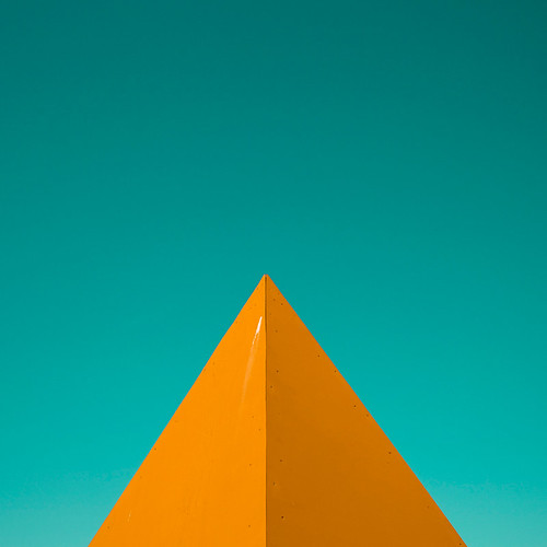
'Untitled' by Heartbeatbox
This photograph is a perfect example of minimalism. At first you might look at it and think there's not much to it (and you'd be right) but I bet it took a lot of thought to get the angle right. And it's not an obvious colour combination but the orange and turquoise just work so well together. I'm actually wondering what this is a small corner of. It looks to me like a boat but I'm guessing it must be a building. Any suggestions?
Labels:
abstract,
Heartbeatbox,
orange,
photography,
photos,
turquoise
Subscribe to:
Post Comments (Atom)


No comments:
Post a Comment